Absolut Klar
Delving into (bottle)shapes, talking to end consumers and bartenders, we explored how to design a new experience while staying true to The Absolut Company’s brand DNA.
The brief consisted of future-proofing The Absolut Vodka brand by designing more sustainable packaging. We asked ourselves, must vodka be fluid? We said no and developed our concept, Absolut Klar.
…must vodka be fluid?
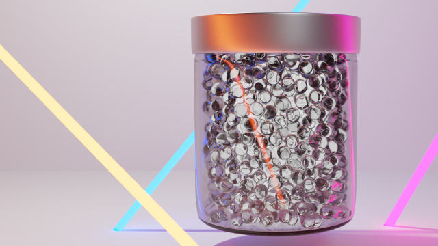
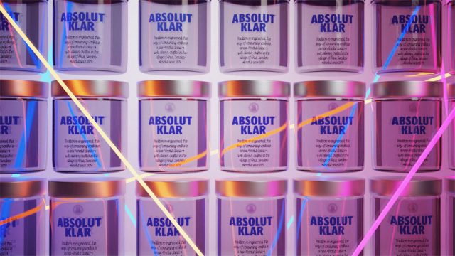
The new product, Absolut Klar, is concentrated vodka pearls that take 50% less space than the current product and therefore require less glass to package. This new packaging can also be stacked for easier transport but also stacked in stores for a visual impact. Not only does the product take less space but the current Absolut Vodka bottle itself is cut in half to signify a new product that stays within the iconic bottle form, but performs more efficiently.
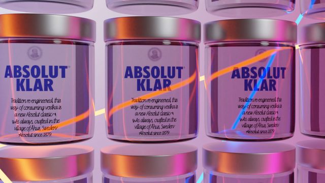
We kept the emblem and the aluminium cap for brand recognition, but choose to use the Swedish type designer, Göran Söderströms typeface Line for a more modern contemporary take on the script label used today. By using Line we are celebrating Swedish design and innovation, something that aligns to the Absolut brand.
This concept opens up for new customer behaviours, new ways of mixing a drink and consume Absolut vodka.