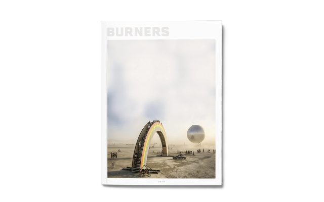
Burners
Client: n/a
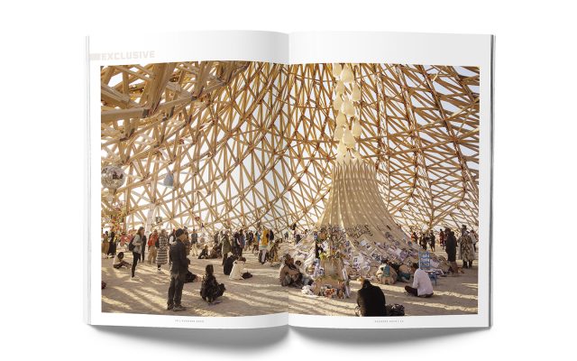
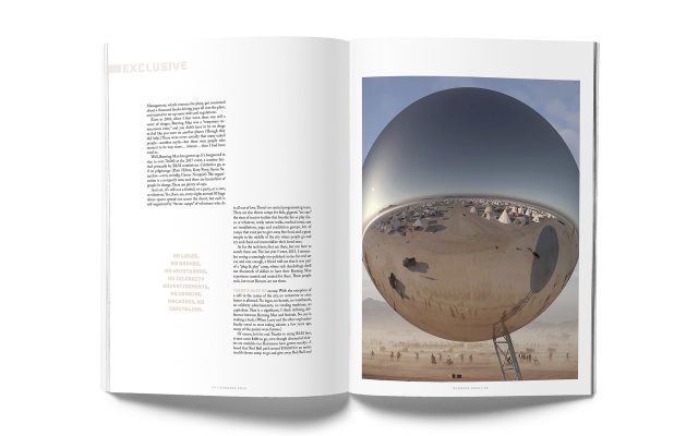
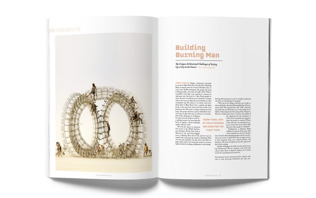
Burning Man is a world-renowned phenome where people pilgrimage from all over the world to spend a week in the Nevada desert in the middle of the sizzling hot summer along with 80 000 participants to co-create a cultural experience. The exploited, misconceived, mythical and hyped event needed to be packaged and communicated through a magazine where things could be clarified. Everything associated with Burning Man and the amazing scenery captured in images had to be communicated to new, old and future “burners” (people who have been participants at Burning Man).
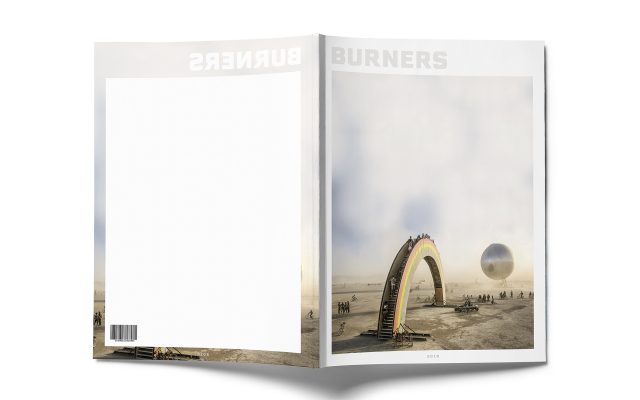
I wanted to communicate the feeling of the arid desert, spirituality and community in the design by making a composition with a lot of air and white space; using powerful but calm imagery, amiable typography with both character and pride combined with humble colors. The graphic identity of the magazine is meant to honor the Burning Man culture, communicate the essence of the event and the participants commitment and dedication that is making the event possible. By deciding on imagery, composition, typography and colors that were meant to cater to the target audience of new, old and future “burners” I created a magazine that includes all essential parts of editorial design, including name, logotype, cover, content page, collage page, reportage and interview.