Devour Magazine
During a 4-week editorial design course at Berghs School of Communication, under the guidance of Pompe Hedengren (Creative Director at Stockholm Graphics) and Daniela Kisch Juvall (Art Director), I developed a concept, defined my magazine’s target audience and created a graphic identity, image selection, composition, typography, colour choice etc. and designed a magazine based on my love of food and interest in travelling.
Devour immerses you in a greedy visual experience of food and travel.
The Concept
My target audience is curious, hungry and cosmopolitan spirited individuals that are interested in exploring possibilities and their surroundings. Their hobbies include culture, art, food, travelling and their income level enables them to often pursue their interests. They are interested in collecting experiences and memories and not necessarily material things.
I wanted to make a travel magazine that inspires first and educates second. The format should be portable and design recognizable, making the reader part of a tribe. Devour Magazine caters to an audience that wants a curated selection of culinary activities abroad. Devour Magazine is curious and explorative, exuberant and greedy, documentary.
For my efforts, I received a letter of recommendation, alongside 5 other fellow students.
The Visuals
The logo was created to convey gluttony and fullness. Based on an Azo Sans Uber, I manipulated shapes so that they are usually straight shapes was now “thick” and “overflowing”. Had I had to do it again today, I would have done a better apex on the R.
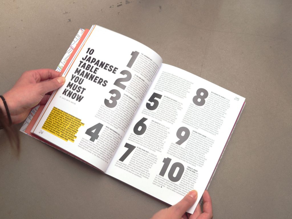
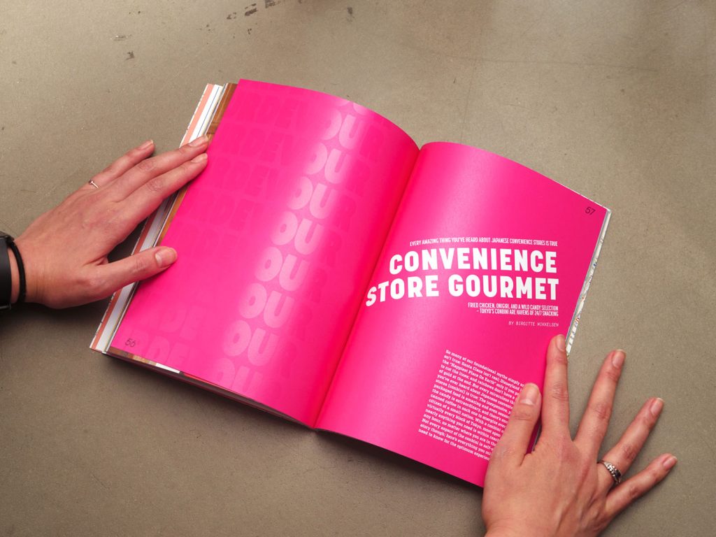
My other typography choices were Factoria as a body text, a slab serif with lots of character and good readability. As a contrast, I used Korolev on the headings, bold entries and quotes. I have a love for Korolev for its historical inspiration (Typographer Rian Hughes was based on Russian propaganda signs and was named after Sergei Korolev a Soviet rocket designer and space pioneer). I also used Base Mono in captions and information texts, quite obstinate since you are not supposed to use monospaced typefaces on printed matter.
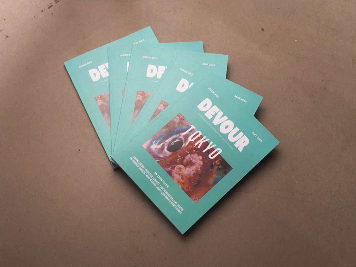
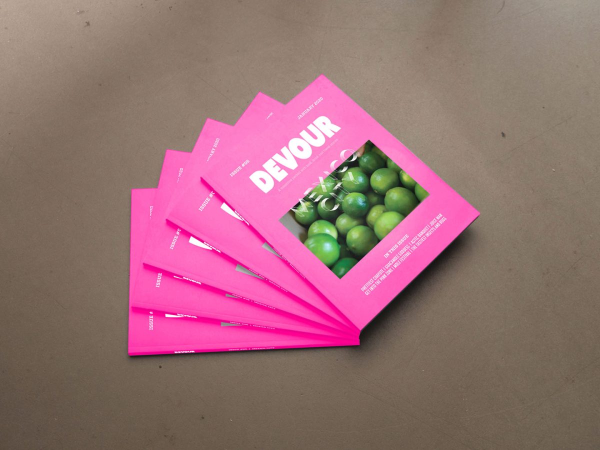
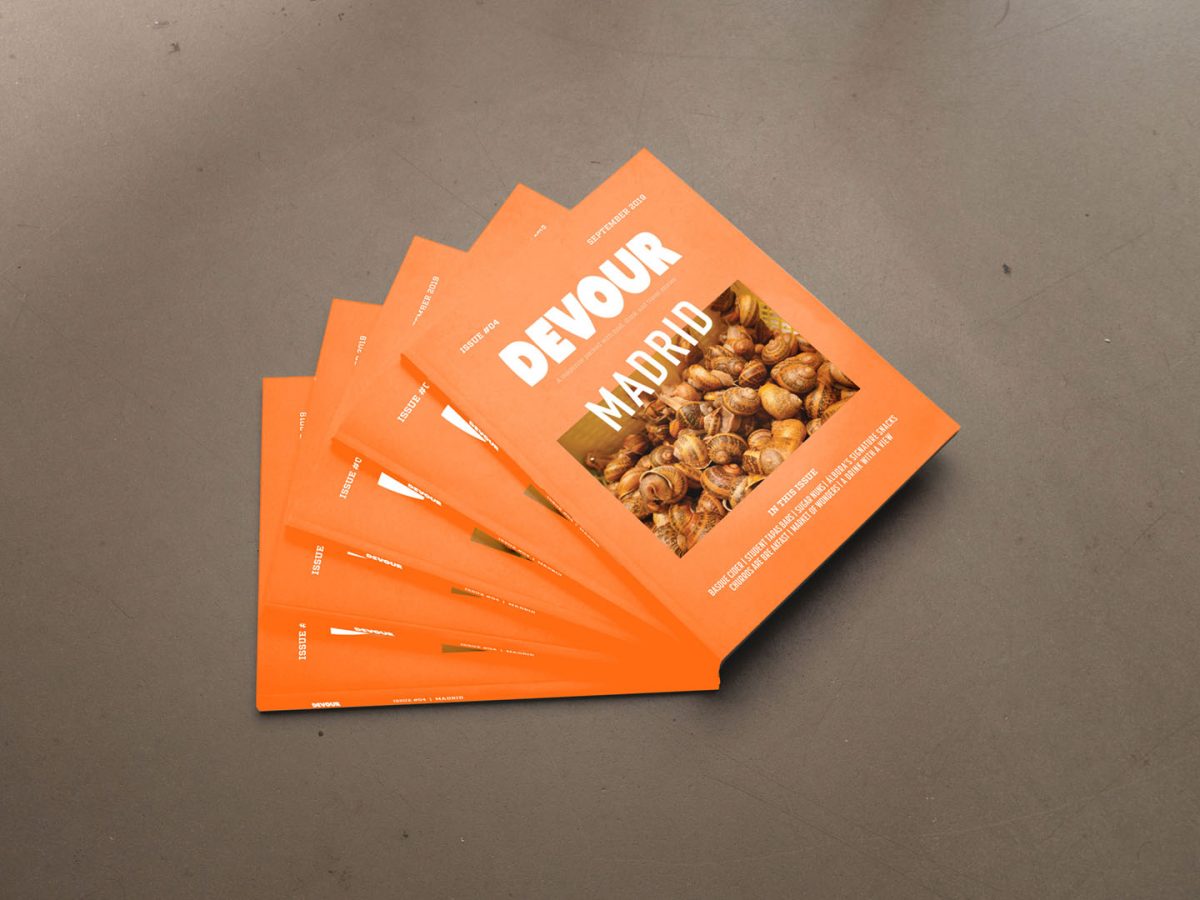
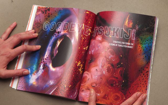
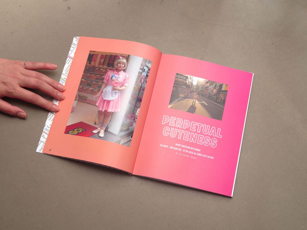
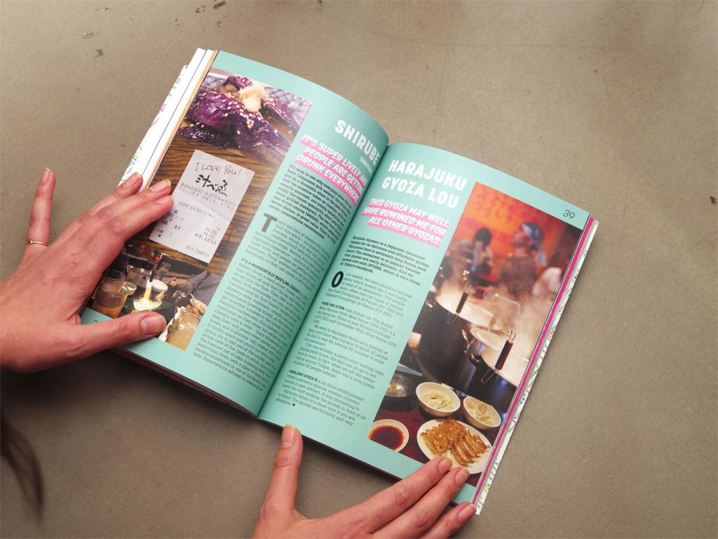
Image choices were made to convey realism. Gritty snapshots that show you the beautiful world as is.
The result was Devour Magazine, a magazine that in every edition takes you to a new city and though intimate documentary style photography shows you the food, the places and the people that make out a city’s culinary soul. Devour immerses you in a greedy visual experience of food and travel. Devour was described as colourful, vibrant and fun.