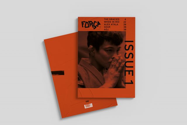
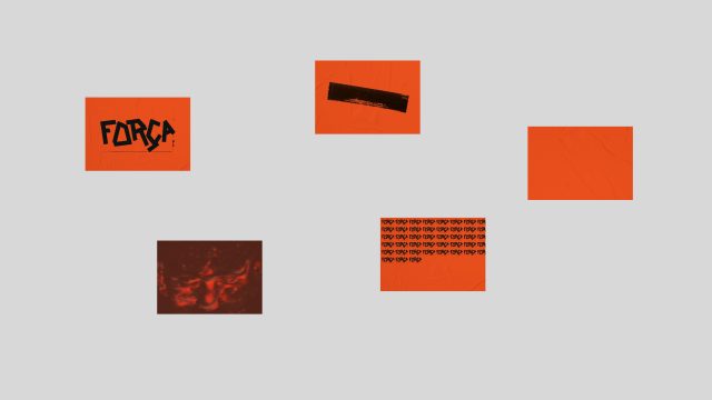
FORÇA
Redaktionell design
Literally a magazine about blood sweat and tears.
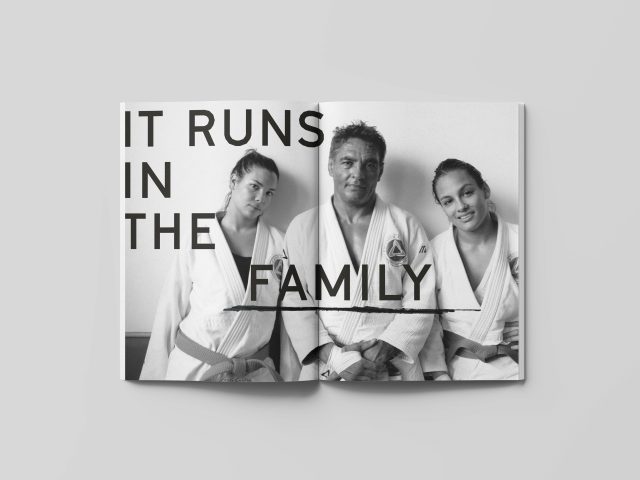
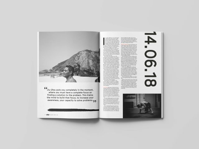
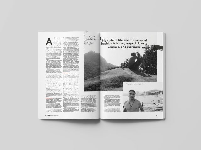
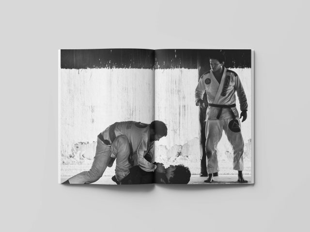
This is a magazine about the sport of Brazilian jiu-jitsu. I wanted the magazine to ooze attitude and self confidence as the sport itself. The strong orange color together with the hand drawn logotype became the starting point of the visual identity of the magazine. Other important visual pieces includes the crumpled texture which is to illustrate the grip’s central function in the sport. Large airy margins symbolizes the importance of managing the distance when grappling. The typography for the headlines are set in large uppercase to give a bold and in-your-face feeling. The typeface used is Cinetype which originally was created as a homage to movie subtitles. It has a mechanical feel to it which represents the technique in jiu-jitsu .