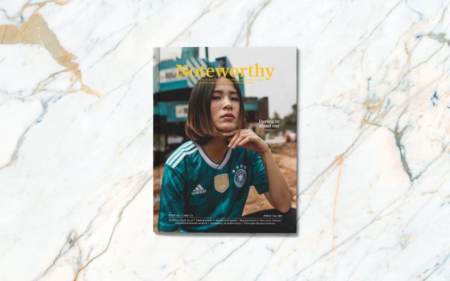
Noteworthy
I don’t know about you but I love physical magazines, feeling the weight of a book in your hands, turning the pages one by one is hard to replace with digital means, so when I had the chance to create one from scratch I knew exactly what I wanted to do. Noteworthy is a magazine about people’s personal stories, historical events, photography, art, and everyday tips, an LGBTQAI+ focused magazine worth taking your time reading.
The name Noteworthy means; Worth paying attention to; interesting or significant. I wanted to create a magazine that felt welcoming, that wasn’t focused on only fashion, and provided something that I was missing at the time, a magazine with a twist.
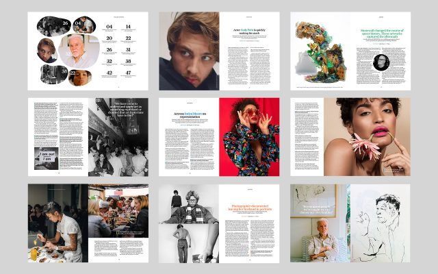
A selection of pages from the magazine
It was important to me that the magazine reflected reality, which meant that as little as possible of the content was fictional. While I handpicked everything it was easy to find interesting reading material but sadly the stories didn’t always come with pictures. A handful of the missing images had to be filled out with stock photos but I spent a lot of time trying to find images that felt as genuine as possible.
When it comes to the design decisions I went with Farnham, a sans serif typeface with a soft personality, it fitted well with the overall warm inviting feeling I was going for, Azo Sans was used for parts like the byline and running head. I am grateful for Daniela Kisch Juvall (Art Director) and Pompe Hedengren (Creative Director at Stockholm Graphics) as they guided me through this journey. I really enjoyed the process of creating a magazine highlighting a subject near and dear to my heart, hopefully, you will think it would be worth reading if it existed on the shelves today.
Sidenote: Looking for some LGBT+ news? Keep up with the latest within queer culture: them.us
Explore my profile to learn more about me and other projects I have worked on.